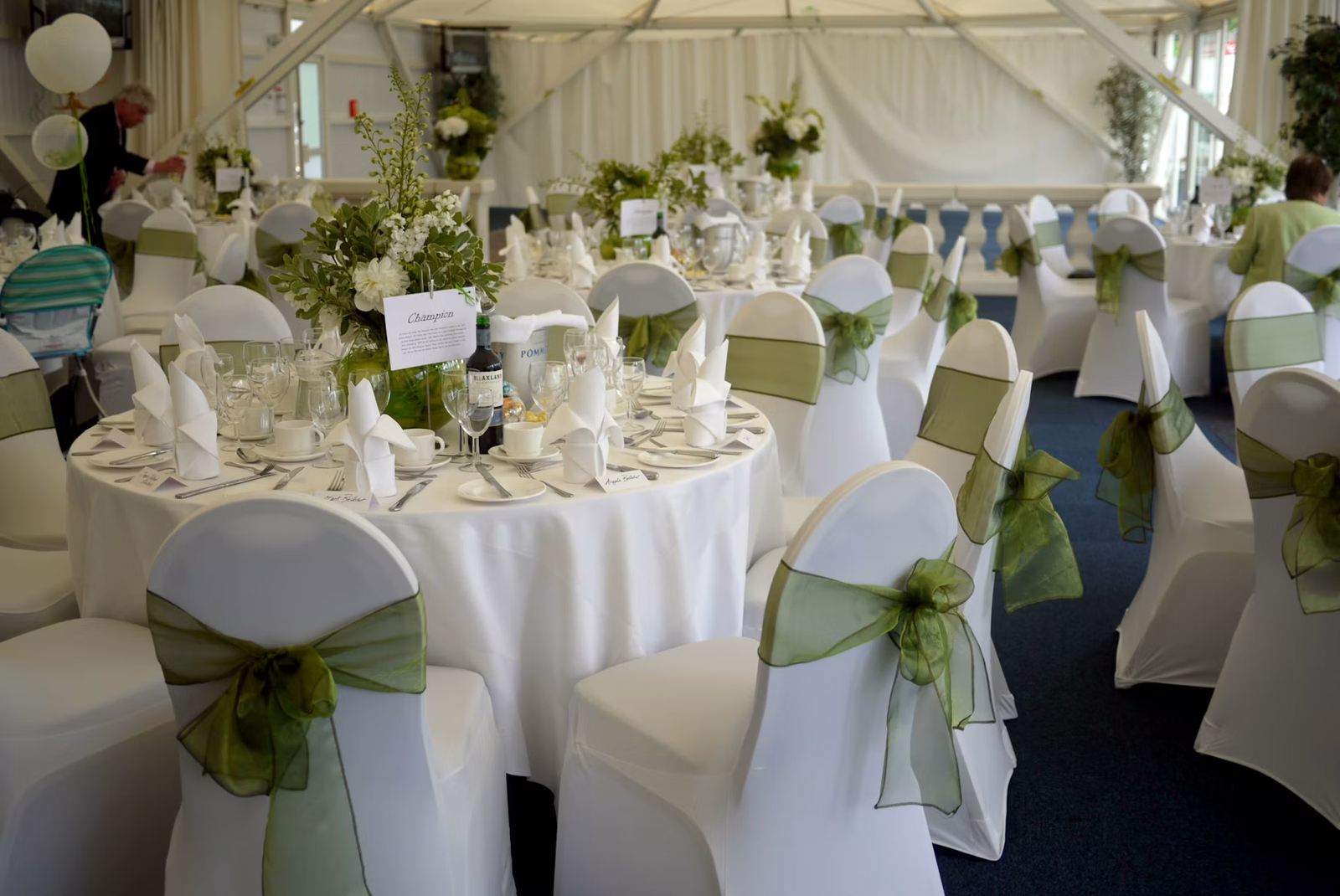
A wedding table plan has a simple job: help guests work out where they are sitting.
But because it is often one of the first things people see as they enter the reception, it also becomes part of the overall look of the room.
The best table plans manage to do both. They are clear enough for guests to understand immediately, while still feeling considered alongside the stationery, styling and venue.
This guide covers the practical decisions first, then the design details that can make the finished display feel part of the wedding rather than just a list of names.
TABLE PLAN VS SEATING CHART: WHAT’S THE DIFFERENCE?
The two terms are often used interchangeably, but there is a small difference.
A table plan normally tells each guest which table they have been assigned to, leaving them free to choose a seat once they get there. A seating chart can go one step further and assign each guest an individual seat.
For most UK weddings, assigning people to a table is enough. Place cards can then be used at each setting if you want to decide exactly where everyone sits.
Whichever approach you choose, the main purpose is the same: guests should be able to enter the reception, find their place quickly and avoid a crowd forming while everyone works out where they are supposed to go.
HOW TO ORGANISE YOUR WEDDING GUESTS
Wait until you have a reasonably firm RSVP list before trying to finalise the table plan. Moving a few names is easy. Trying to plan around a guest list that is still changing can quickly turn into a puzzle.
Start with the tables themselves. Confirm with the venue what shapes and sizes are available and how many people each can comfortably seat. Once you know the structure of the room, start grouping guests.
Family and existing friendship groups are the obvious starting point, but everyone does not need to sit only with people they already know. Think about personalities as well. A table with a good mix of people who are likely to talk to one another will usually work better than simply putting every colleague, cousin or university friend together.
Then think practically. Older guests may appreciate being away from loud speakers. Guests with mobility requirements may need easier access. Families with young children might benefit from particular positions in the room.
The aim is not to create a perfect social formula. It is simply to make the room comfortable and give guests a good chance of enjoying the people around them.
ROUND TABLES VS LONG TABLES
There is no single right answer. The venue, guest numbers and atmosphere you want should make the decision.
Round tables are a familiar wedding layout and make it relatively easy for guests around the table to speak to one another. Around six to ten guests per table is common, although the actual number should always be confirmed with your venue.
Long or rectangular tables create a very different look. They can work particularly well in barns, country venues and more contemporary spaces, and they can make efficient use of the room.
Conversation tends to happen more naturally with the people immediately around you rather than everyone at the table.
You also do not have to choose one format throughout. A mixture can work if the venue layout allows it.
Before getting attached to a layout you have seen online, ask the venue what works in the room. Pillars, doorways, dance floors, service routes and fire-safety requirements can all affect what is actually practical.
MIRRORS, FABRIC, ACRYLIC OR PAPER?
Once you have worked out where everyone is sitting, the table plan becomes a design decision as much as an organisational one.
Mirror table plans work well when you want something more decorative or formal. An existing statement mirror can become part of the room styling rather than looking like another piece of stationery.
Fabric table plans have a softer feel and suit weddings with an editorial or relaxed design. They work particularly well when the typography is kept simple and the surrounding styling does the rest of the work.
Acrylic creates a cleaner, more contemporary look. Clear, frosted or coloured acrylic can work particularly well for modern venues and minimal styling.
Printed paper or board should not be overlooked either. It is flexible, easy to coordinate with invitations, menus and table numbers, and can look every bit as considered when the typography, paper and frame are chosen well.
The material matters less than how well it fits the rest of the day. A beautiful mirror is not automatically better than a printed plan if the printed version works more naturally with the venue and styling.
If you are coordinating several visual elements for the reception, it is worth looking at them together. Table signage, menus, backdrops and even the photo booth print design can share the same typography, colours or styling without everything needing to match exactly.
COMMON WEDDING TABLE PLAN MISTAKES TO AVOID
MAKING IT DIFFICULT TO READ
Names need to be large enough to find quickly. Decorative typography can look beautiful close up but become frustrating when a room full of guests is trying to find their table.
FORGETTING SOMEBODY
Check the finished plan against the confirmed guest list before anything goes to print.
OVERCROWDING TABLES
Do not squeeze extra guests onto a table simply because it solves the spreadsheet. Use the venue’s recommended capacities so everyone has enough room to eat and move comfortably.
IGNORING GUEST DYNAMICS
You do not need to engineer perfect friendship groups, but obvious tensions and difficult relationships are worth considering.
LEAVING IT UNTIL THE LAST MINUTE
Changes will happen, but getting the main structure sorted early gives you time to catch mistakes and gives your stationery or signage supplier enough time to produce the finished piece.
MAKING THE DISPLAY TOO COMPLICATED
Creative table plans can look fantastic, but guests should understand them immediately.
The best designs still answer one very simple question:
Where am I sitting?
THINK ABOUT THE REST OF THE GUEST JOURNEY
The table plan might be one of the first things guests interact with when they enter the reception, but it is only one part of how people move through the room.
Think about what happens next.
Where is the bar? Where will guests gather after dinner? Where is the dance floor? Where will the guest book, photo experience or other entertainment sit?
A well-positioned photo booth can become a natural gathering point later in the evening, but placement matters. It should be visible enough for guests to find without interrupting service routes, entrances or the flow around the tables.
The styling can also work alongside the rest of the room. Backdrop choice, lighting, print design and signage can all be considered alongside the table plan and wedding stationery so the photo experience feels part of the same event rather than something added separately.
EXPLORE WEDDING PHOTO EXPERIENCESKEEP IT CLEAR, THEN MAKE IT YOURS
The best wedding table plans are easy to use first and beautiful second.
Start with the venue, guest list and table layout, then choose a design that feels right for the room and the wider wedding.
Whether that means a simple printed plan, a large mirror or something more bespoke, clarity should always come first. If guests can find their name quickly and the finished piece feels at home in the space, it is doing its job.